During my leveling process, i fell in love with
Mik Scrolling Battle Text. It uncluttered all my damage numbers and condensed them into one simple frame. Since i like minimal with less clutter, it was a perfect fit for my UI setup. That is until i started doing some raids and reassessing my UI needs and layout functionality.
I realized how much i missed seeing damage numbers on top of enemy heads. This was even more evident on trash pulls and adds. Being able to see all the mobs i have dots rolling on individually is a lot more visual and intuitive than having them all combined together into one area. Of course this creates a massive clusterfuck on my screen when there’s lots of mobs but i actually seem to prefer it for this specific situation.
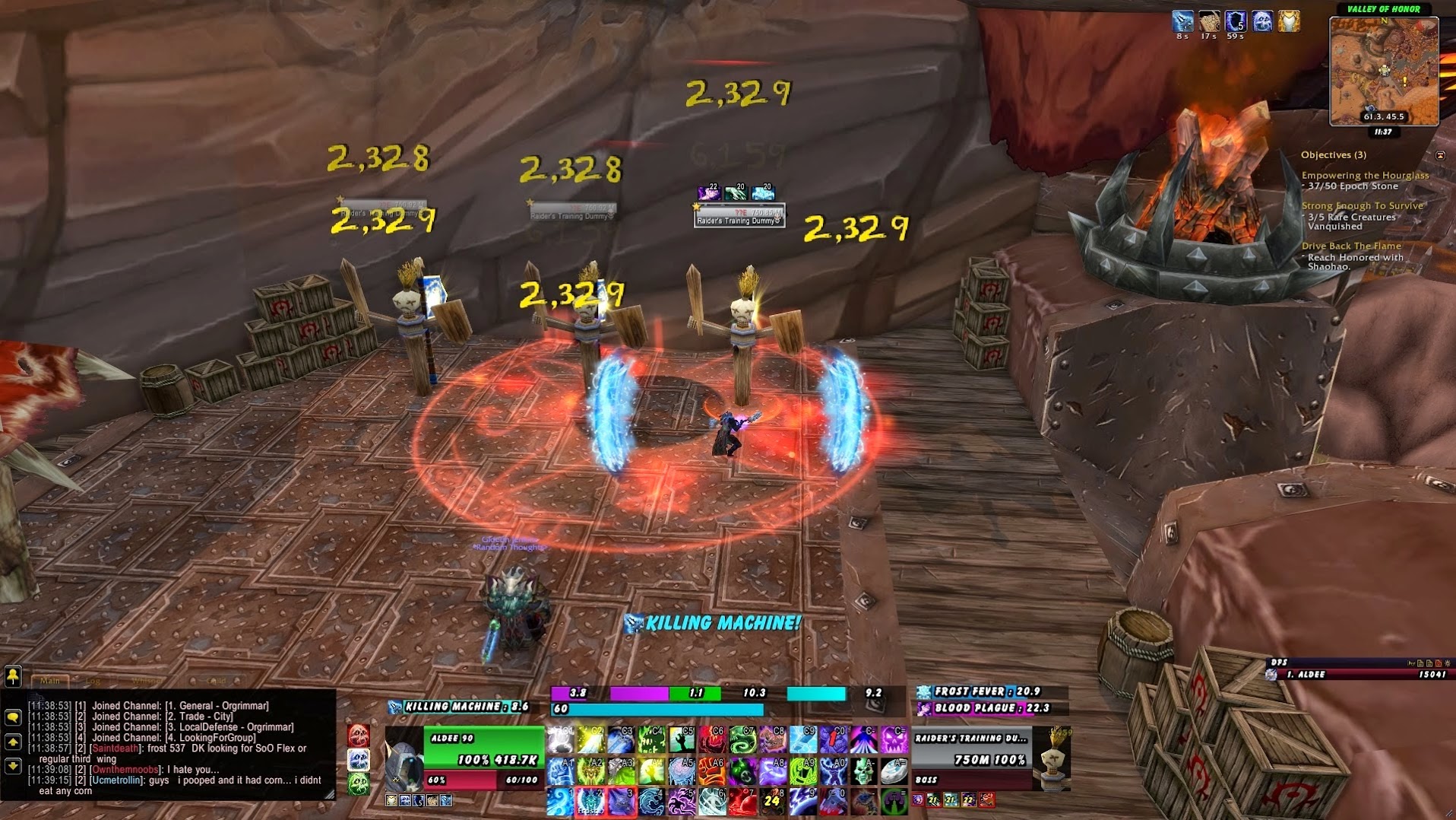
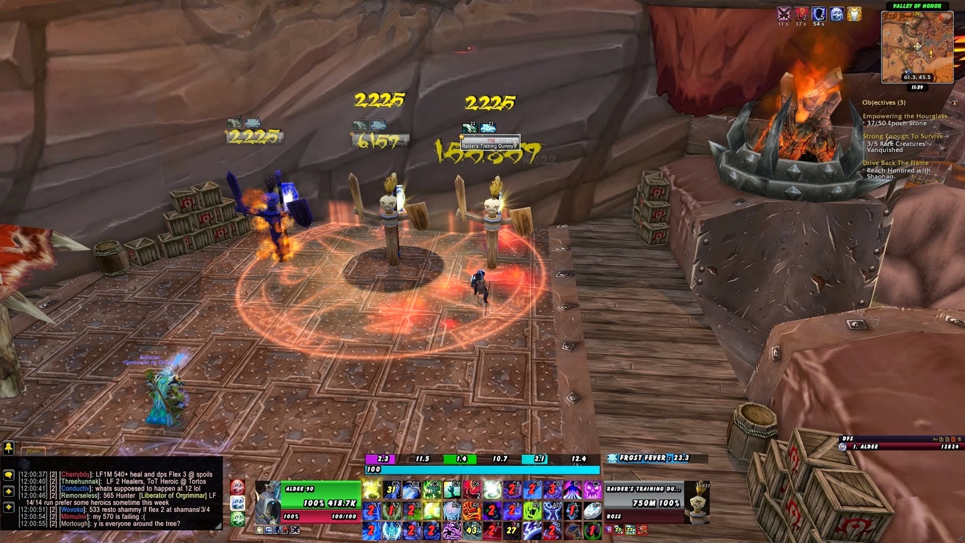
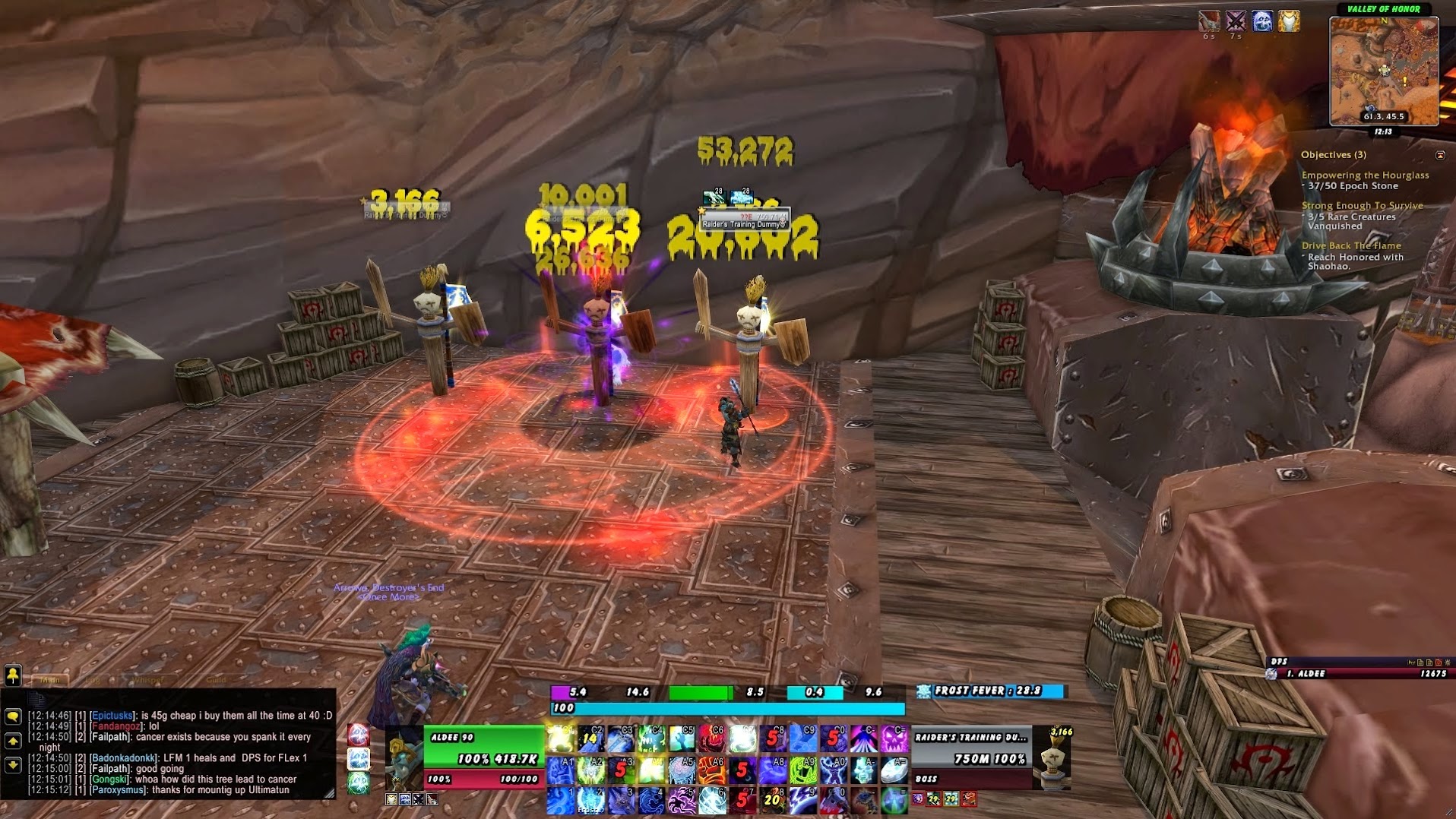
The other issue i had was how much i couldn’t stand the default floating combat text font. Not only is it a boring style but looked quite pixelated as well. Well hurray for Font Damage Changer which let me change the text to any one of the hundred or so fonts i happen to already have for Photoshop projects. Now my problem lies in actually choosing which one i like more than the next and sticking to it for more than a few hours.
 |
| Floydian Normal |
 |
| Shogun’s Clan |
 |
| Double Feature |
